Scale + Gallery Walls : Do This Not That
Scale can be scary because in truth, it usually takes practice to be able to see scale correctly. For a designer, it’s second nature to know what size everything should be so it looks just right, but to the untrained eye it can be hard to determine why that one thing in your space looks off. Scale is important because it really can make or break a design. If something is too big or too small, you’ll feel it because it throws off the balance of the space.
BIGGER IS BETTER
In general we say when in doubt, go big. Art is a great example of this, but it’s also one of the most difficult things to master. It’s way easier to accommodate an oversized piece than to try and overcompensate for something looking too small. A large piece of art will always look grand, while a small piece will look out of place and awkward. For oversized art, a good rule of thumb is that it not extend beyond the complimentary piece of furniture’s edges. In other words, if you are hanging something above a bed or a desk, you want to keep the edges of the frame narrower than the edges of the piece of furniture. If you have tall ceilings, aim for a vertical orientation to draw the eye up, using the ceiling height as a feature of the room.
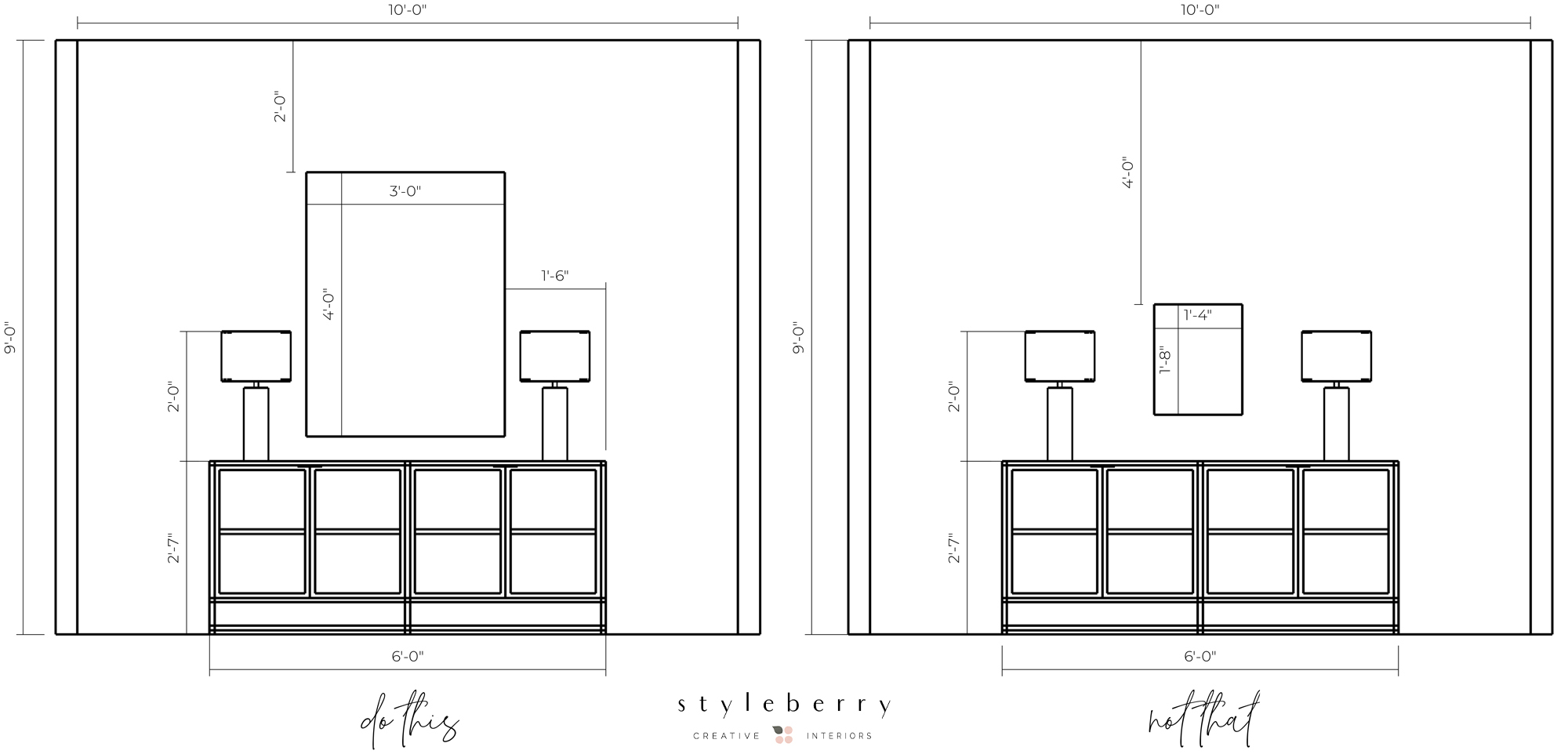
In this illustration, we have the same wall space with a six foot sideboard and two art options. The left is ideal, because the large piece is substantial and interesting, and uses the height of the ceiling to draw the eye up. The right side leaves too much negative space and the art is dwarfed by the empty wall and the ceiling.
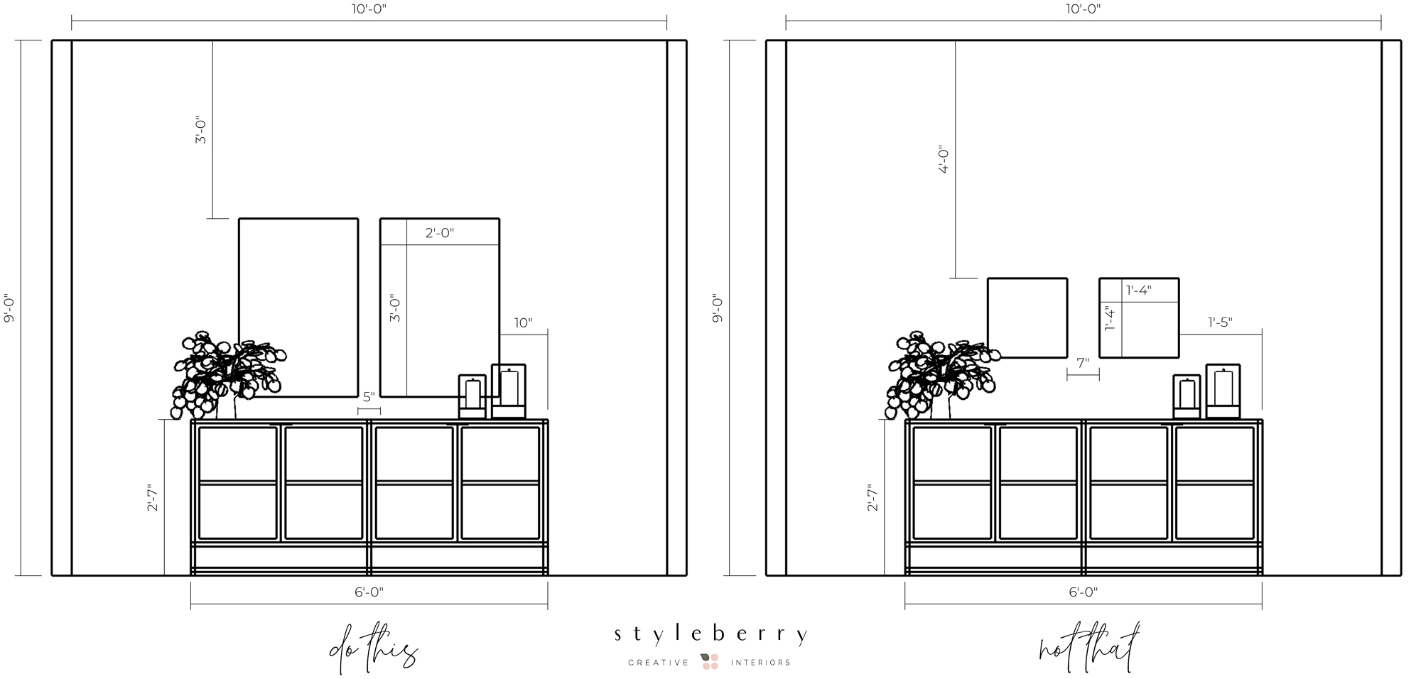
This is another option using larger, but not oversized art above the same sideboard. On the left, the large pair is balanced and proportional, while the right again feels insufficient.
BUILD THE VIGNETTE
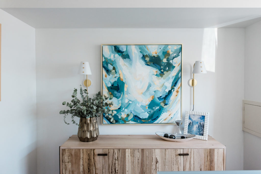
Once you have determined to correct size for your art and furniture, then you can start layering accessories and styling! Scale is important here as well, because if you are using oversized art or furniture, then your accessories should follow and compliment that same scale. If you are adding lamps or greens on either side of a large piece, you want to make sure that the accessory of your choice is tall enough – aim for at least 1/3 the height of the art. You don’t want to add too many objects here, because the art will make enough of a statement, but having something to balance either side is generally a good move.
MIX IT UP
Large, single art pieces aren’t the only way to achieve a proper scale. If you have multiple, smaller pieces or want to showcase multiple photos, a gallery wall is the way to go. Gallery walls can look super sophisticated and chic when done correctly, and they can be more cost effective than an oversized piece. To create a clean, modern look, use one size frame in the same finish and try to coordinate colors within the photos, or go black and white. For a more collected look you can combine different sizes and frames styles and mix together photos, paintings, antique finds, and even objects!
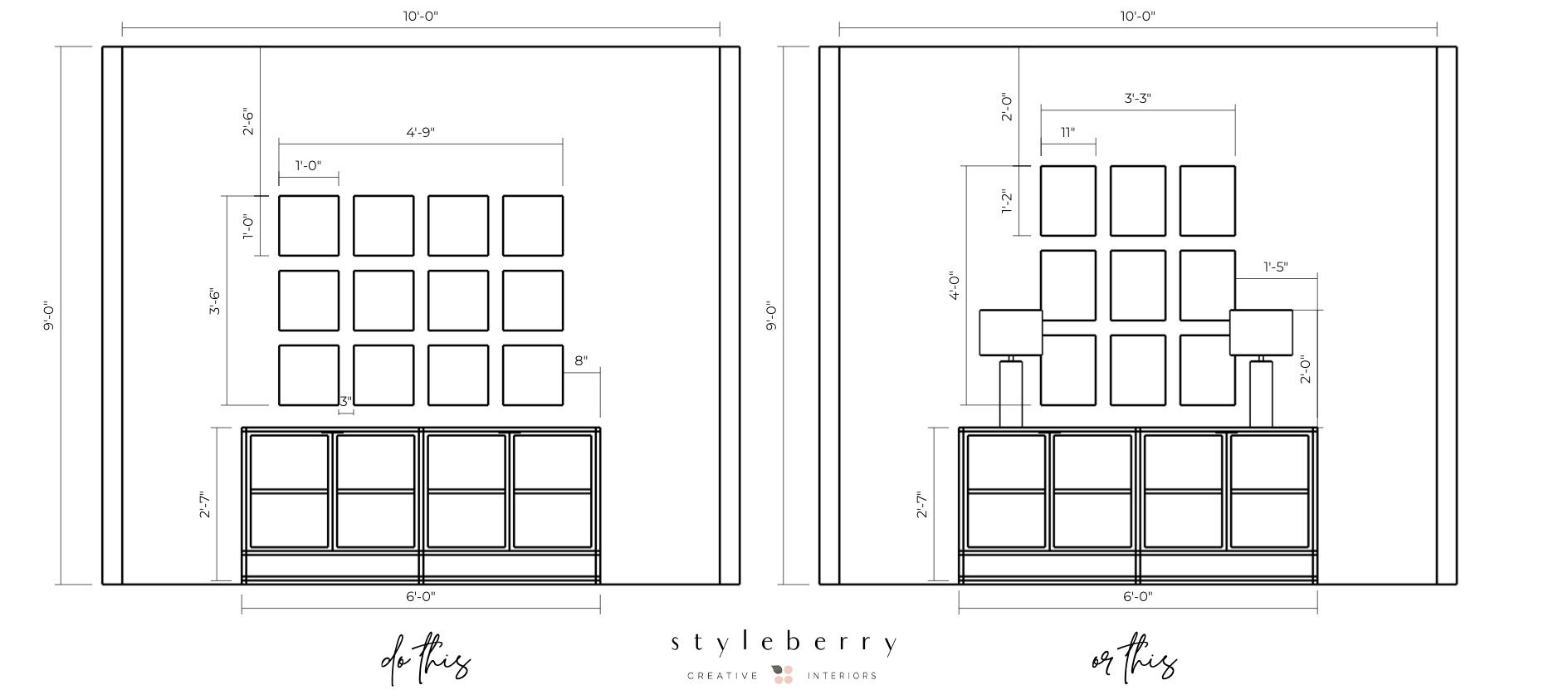
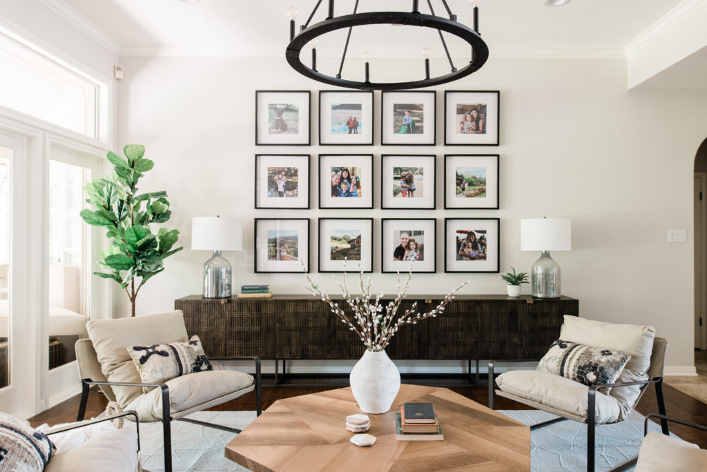
Above is an example of using one frame size for that clean look. On the left is a 4×3 configuration with 12″ square frames. The right creates more height and only uses 9 frames for an equally modern but minimal look. Again, you could add lamps or other accessories on either side, or let the gallery stand on its own as a feature. Remember the rules here, keeping the frames contained within the edges of the piece of furniture, and don’t be afraid to go tall!
These changes are all things you can DIY, from the comfort of your own home! During this time of social distancing and working from home, it has never been more important to really love your space and be able to find peace and joy there. If you’ve been staring at that one blank wall forever, not knowing what to do with it, this is your opportunity to create something beautiful!
We want to share our favorite resources with you for frames and art, so you can tackle this project with confidence and creativity.
Gallery frames: Ikea Ribba, Target, Crate & Barrel
Large & Oversize Frames: Ikea Bjorksta, Ikea Ribba
Art: Minted, Juniper Print Shop, Society 6, BFF Print Shop, Artfully Walls
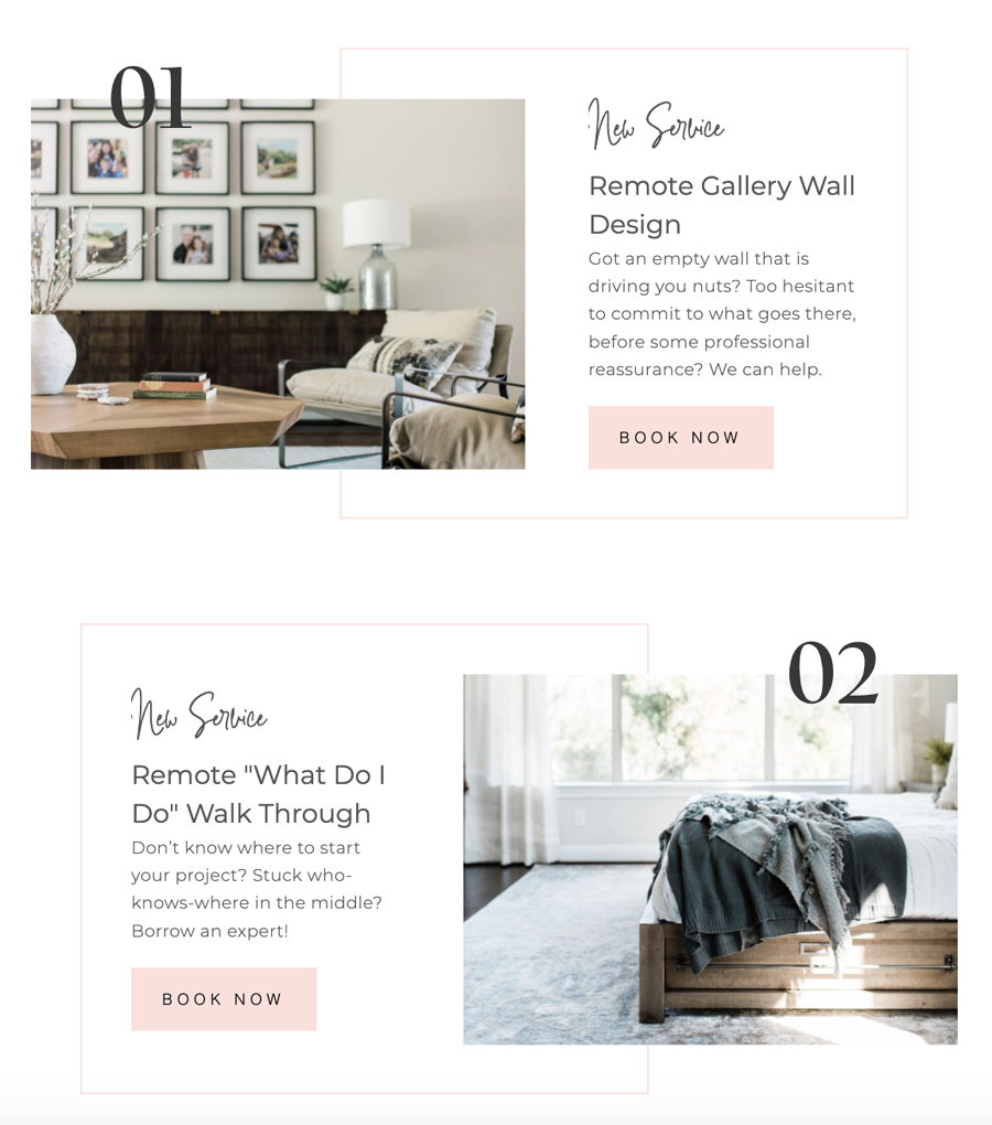
Still confused? Let us help. For a limited time, (as we navigate doing business during this unprecedented time) we are introducing two new E-Services for Social Distancing! We can draw you the perfect gallery wall for your space, and help you select the perfect sized frames for your home. Details below:
If you have a project idea that does not fit into one of these boxes, please contact us here. In an effort to continue to pay (and keep!) my amazing employees, we are offering these heavily discounted E-Services and are open to considering any E-Design projects at this time.
…
Styleberry Creative Interiors is a Full Service Interior Design Firm based in downtown San Antonio, Texas, specializing in fresh, relaxed design completed in a thoughtful, caring way. With a team & design process you can trust, we’ll create a space and experience that will help you finally exhale.