


3 Reasons You’re Choosing the Wrong Paint Color for Your Home
If you look at a room and “see” that it looks good, a lot of it has to do with your paint color. The right colors can create an ambiance, make a room feel brighter or cozier, add depth, or put you instantly at ease the moment you walk in the door.
However, color is both art & a science. And unfortunately, there are a lot of mixed messages out there creating confusion. In fact, I get more questions about color than any other element in interior design! So, why is choosing color difficult for so many people?
1. Mass media sends an outdated message.
I know this is difficult to believe, but mass media serves us a carefully curated color palette. It’s generally one that will appeal to the masses and is based on a trend that has long since passed. Networks like HGTV are pros at this…they make everything vanilla so that no one is offended by a strong sense of style.
Case in point: Hello, gray floor trend! In reality, cold gray tones have been out of style for years now. (Who wants to live in a storm cloud?! Or a sterile hospital?!) However, they do this so that everyone will feel safe mimicking their projects and, voilà, the network stays useful and relevant. Unfortunately, this has led to more homeowner confusion and color avoidance than anything else.
2. Paint color replication does not equal success.
The other challenge is that you have access to thousands of designers’ work on social media, like Instagram and Pinterest. Of course, the natural instinct to replicate what you see. But if you asked me — “What paint color did you use on the walls in this bathroom?” — my answer isn’t going to help you.
99% of the time, if you take a paint color you see in someone else’s home and try it in yours — gasp! — it will look completely different. Why? Because your home, lighting, and ancillary materials aren’t the same as they are in the home you saw online. That’s simply the nature of color. Which brings me to my last point…
3. Color is ridiculously sensitive.
As if all of that wasn’t enough, color itself is a fickle thing. A single color can change in appearance during the day, from sunrise to midday to dusk, & can look completely different depending on what’s around it: furnishings, a stone fireplace, trees outside, even your neighbor’s house!
This is why I have personally picked different neutral colors for different rooms in the same house, based on changes in lighting and exterior reflections. & the hardest homes to pick colors for are those surrounded by trees — that green cast is TOUGH!
Add all of these challenges up (and the fact that color mistakes can be costly), & it’s easy to see why the average consumer doesn’t trust themself. Which is a shame, because there is a world of joy to be found in the right hues! So, what’s the right way to select colors?
How to Select the Right Paint Colors
Option 1. Understand Undertones
The secret to color selection is understanding undertones, which are the subtle colors that exist underneath the obvious hue. For example, nearly any white you choose will have an undertone that shifts it ever so slightly toward green or blue, violet or pink, yellow or orange, and even gray. This is true of all colors — you will rarely find them in a “pure” form!
Why do undertones matter? Because our eyes can see the disharmony created when colors with two different undertones are paired together. We need undertones to work together to create a cohesive palette. & once you understand the undertones at play in the space, you will be able to pair colors together like an expert.
To help, I’ve created a free guide to help you diagnose the undertones in your own space, along with our foolproof paint pairings that go along with each. (This is an amazing resource!)

Option 2: Work with a Designer
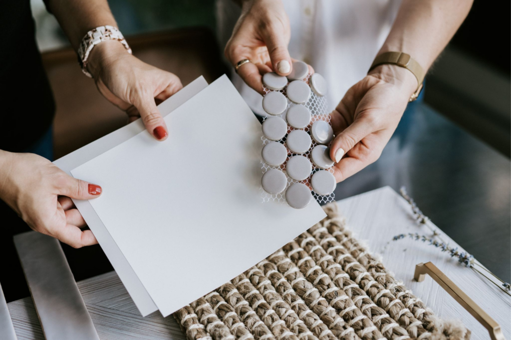
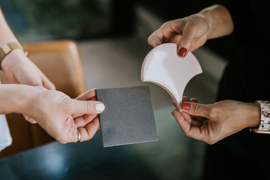
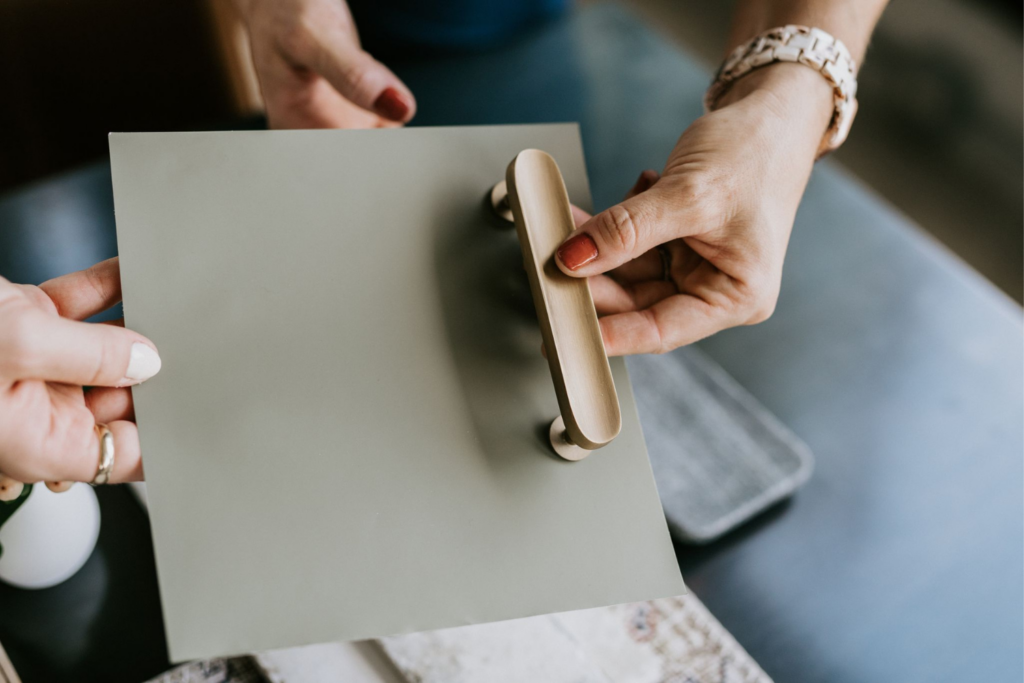
Whether you’re renovating or furnishing your home, selecting the wrong paint colors (or colors for your sofa, wood/tile flooring, backsplash, etc.) can be a very costly error when it goes wrong. That’s why investing in professional color guidance is always money well spent.
We have several design options available to you, depending on the level of involvement you’d like. But honestly, even if you don’t work with us, I would advise you to hire a well-trained professional. (Please don’t choose paint colors in the aisle of Home Depot…that only leads to regret! The right designer will help you fall in love with color, and by extension, your home. & that’s worth every penny.
Well, that’s it for now, but in a couple weeks, I’ll be back here to talk about the magic behind moodboards… which I would probably call “Step 2” of creating a color palette for your home.
In the meantime, don’t forget to grab my No-Regrets Guide to Paint Pairings. I will see you then!
Xo,
Shawna
Styleberry Creative Interiors specializes in fresh, relaxed design crafted in a meaningful way. With a team and process you can trust, we’ll help you create soul-soothing spaces that inspire you to unwind, connect, and finally… exhale. Our studio is based in downtown San Antonio, Texas and serves clients in the Alamo Heights, Olmos Park, and greater San Antonio Metropolitan areas, as well as Nationwide.

