Before & After: Hunter’s Creek Primary Bathroom Renovation
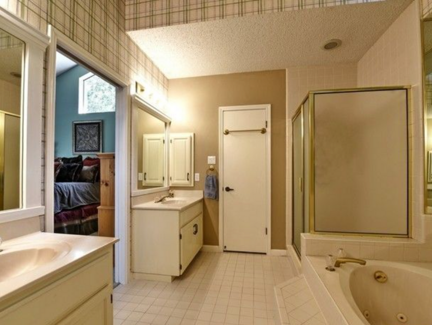
Brace yourself for this one… this Primary Bathroom Before & After is SO GOOD that it might just make you want to buy the ugliest house on the block to see if you can do it yourself! I mean, burgundy striped wallpaper AND swinging saloon doors?! SIGN ME UP.
Before Renovation: Hunter’s Creek Primary Bathroom


The good news? Wherever there is a scary bathroom, there is potential! The best part about this Primary Bathroom renovation was that we knew the layout was really good. We didn’t need to move anything but a doorway (to add a pair of symmetrical vanities), which helped make this project rather simple in scope.
Sometimes, when we aren’t creating anything custom or moving plumbing and electrical, we’ll design what we call a “Standard Bathroom” and select the hardscape materials and generate a concept, but without the drawings. That’s exactly what this was. (Read here for 3 BIG reasons to hire a designer before renovating.)
Ready to witness the power of fresh and new materials? You’ll never believe what it looks like now…
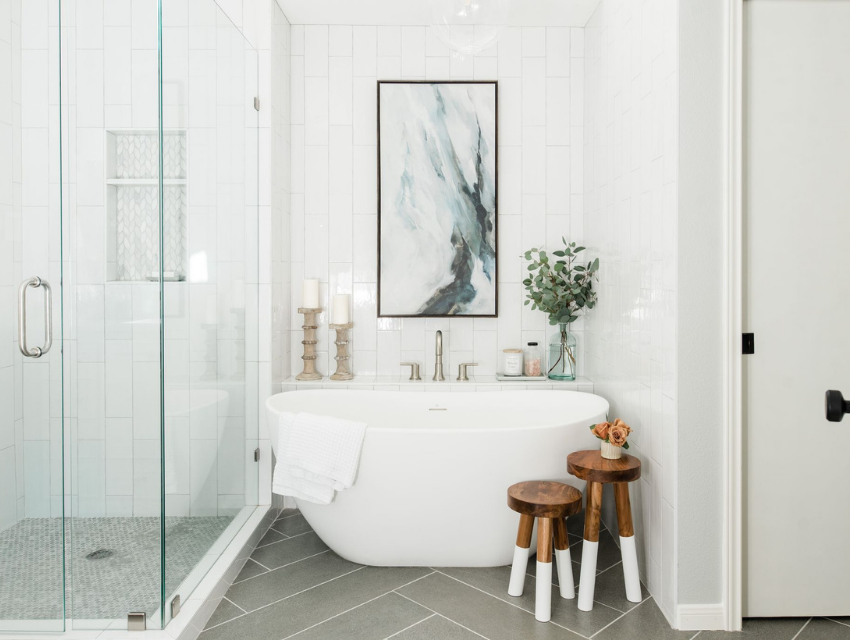
After Renovation: Hunter’s Creek Primary Bathroom

Large tiles in a herringbone pattern, fresh white subway tile for the walls, a clean-lined tub, glass pendants, and touches of art and decor transform this primary bathroom! It feels nature-inspired, relaxed, and livable.

Every bathtub has it’s soul-soothing essentials — bath salts, a candle, fresh greenery, and art with relaxing colors and some interesting movement.

This maroon and navy rug helps unify the warm and cool tones in the room — and offer some warmth for chilly toes. In the shower, we added penny tile flooring and this organic-inspired tile for the nook…

This marble mosaic is beautiful, interesting, and adds a splash of surprise to a predominantly white shower.

For the vanities, we selected this warm shade of white, paired with brass hardware, beautiful transitional sconces, and a fun-shaped mirror. (P.S. Did you notice we mixed metals in this space?)

Let’s get a close-up of the sconces…. Isn’t it pretty?? Simple yet sophisticated. Design is in the details! Okay, one last look at the whole space…

Ahhh… so much better than stripes and saloon doors, right? Now this formerly Texan bathroom is a California-fresh inspired space where our clients can walk in and… exhale.
Xoxo,
Shawna
Styleberry Creative Interiors specializes in fresh, relaxed design crafted in a meaningful way. With a team and process you can trust, we’ll help you create soul-soothing spaces that inspire you to unwind, connect, and finally… exhale.
Styleberry Creative Interiors is based in downtown San Antonio, Texas and serves clients in the Alamo Heights, Olmos Park, greater San Antonio Metropolitan area and Nationwide.