The Case for Black & White
Color may be our superpower here at Styleberry, but the unsung hero of almost every space we create in San Antonio (and beyond) is black and white. Plot twist, right?! Shawna and I always joke about her love of color and my love of well… the exact opposite. This may seem like a clumsy pairing considering we design spaces together but the truth is, a beautiful color story cannot happen without the presence of black and white. Behind every carefully crafted colorful space is a base layer powered by neutrals – that is the secret formula.

Black and White alone is not boring
First things first, when did this combination become boring and bland? If anything, black and white is iconic. It’s elegant, simple, foolproof, and goes with literally everything. What is not to like!!! Okay… maybe I’m too anti-color but I will argue that while the monochrome life is not for everyone, black and white has a place in every home no matter the style. The natural contrast of the two colors easily creates focal points and enhances the architecture of your space. We will suggest light paint on the walls 99% of the time, and we almost always bring in black accents with lighting and hardware to make a subtle statement.
Black and white sets the stage
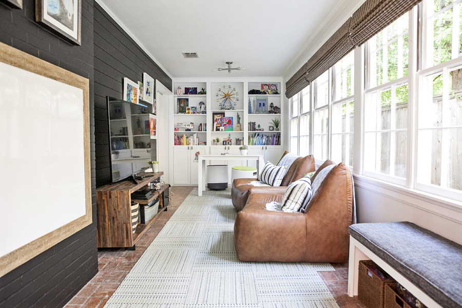
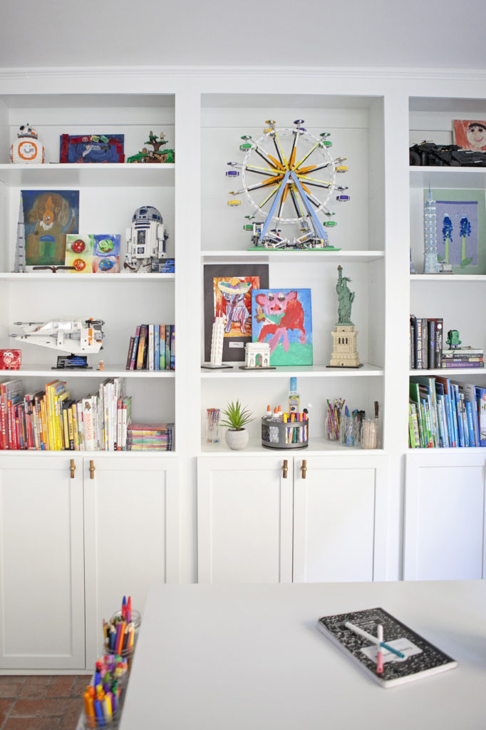
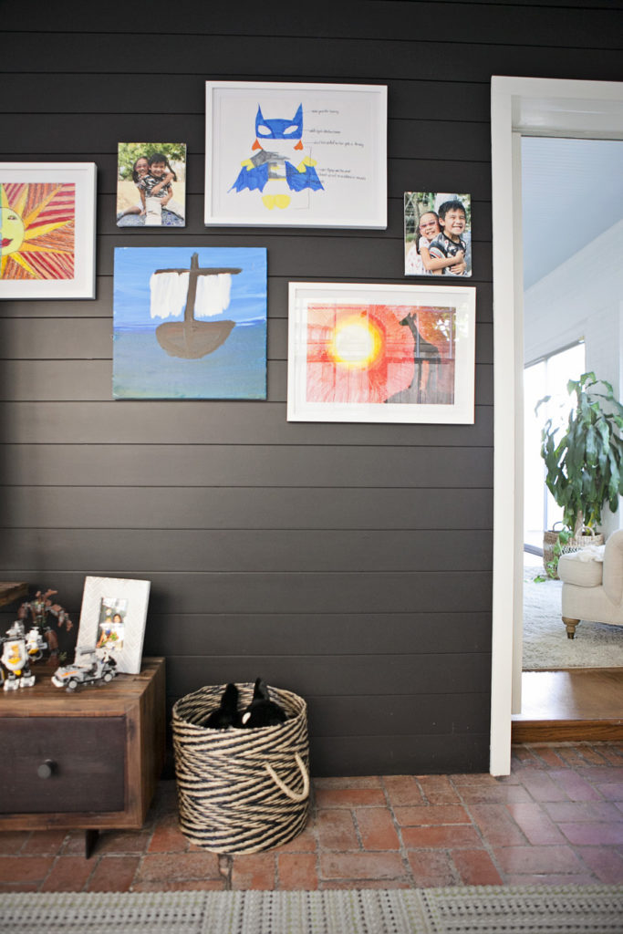
Imagine walking into a room with a color on every surface. Blue walls, red floors, pink sofa, yellow curtains. I’m panicking just thinking about it. In the name of sanity, even the most vibrant designs need relief in the form of black and white. One of my favorite examples of this is the Primera Project Playroom. The challenge was to create this oasis for kids art, games, and toys, but keep it feeling modern and grown up so that it could change through the years and still feel like part of the rest of the house. We had every color of the rainbow to work with, but the clear answer was to keep it black and white so the actual purpose of the room, the kids creations, could shine.


Black and White is adaptable
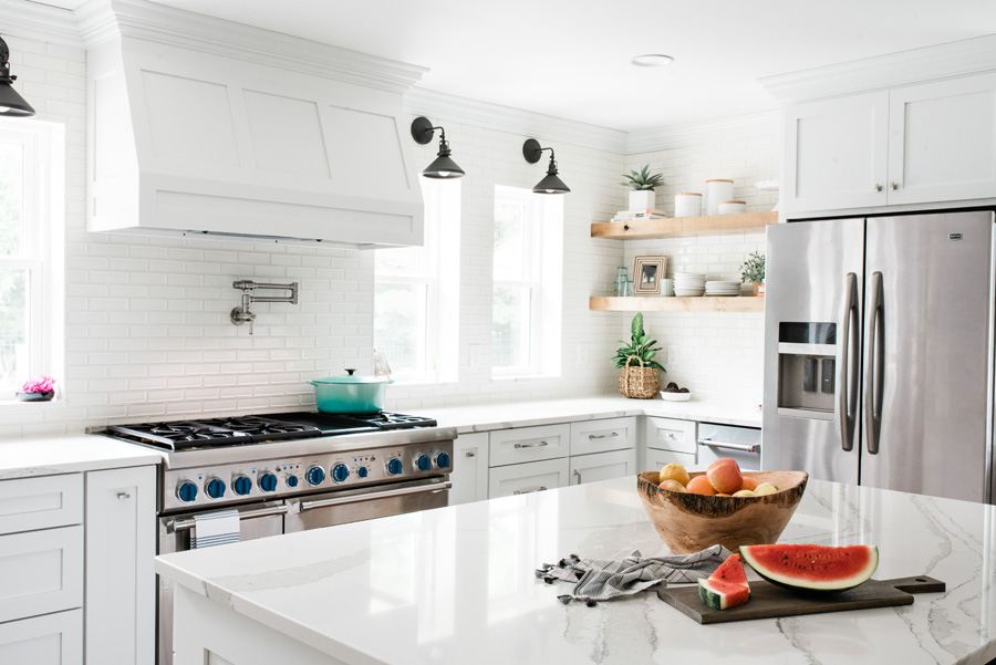
The beauty of black and white is that it can be the foundation for any style, season, or trend. Every October, I am flooded with images and content of other designers and bloggers dusting off their fall decor and transforming their homes into an autumnal sanctuary. Some go all out, while others choose to keep it simple. Either way, a black and white space offers an easy solution to our desire for a fresh look every now-and-then. The Peacock Farm Project boasts a beautiful white kitchen, which is the perfect blank slate to allow for seasonal decor and the possibility of an evolving personal style. It was summer when this kitchen was completed, so a watermelon felt right at home on this island. But now that temps are dropping, swap out the fruit with a few pumpkins and call it fall!

If you are inspired by all the possibility of black and white and feel like your home could use a few fun accents, here are some of our favorite things for a neutral (but never boring) home.

