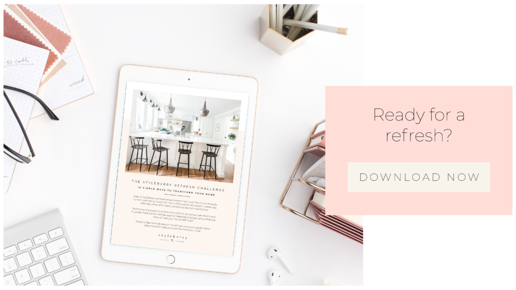
The Styleberry Refresh Challenge
Here at Styleberry, we have always known how much the home impacts human well-being. Now that much of the world is staying in place, day after day, week after week, we bet you are noticing this too.
Home has the power to soothe and comfort–as well as overwhelm and frustrate. As we worked on our new E-Design offerings, we also hosted a ten day #StyleberryRefreshChallenge over on insta, with some simple tips to help you transform your home with what you have.
If you get to the end and want to dive deeper, we’ve got a free workbook to help you love that home you’re [stuck] in! Let’s GO!
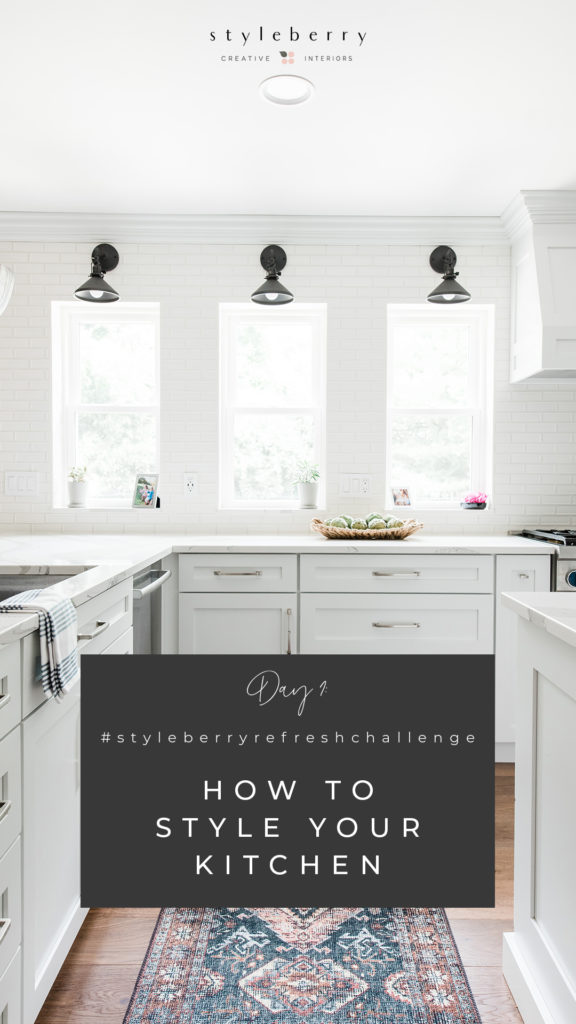
How much you can remove from your kitchen counter today. If it lives there, but you don’t use it every day, we are going to nudge you to give it a new home. Why?
Clear kitchen counters are like a breath of fresh air! Clutter-free corners help us exhale. Promise!
What gets to stay?
We love keeping a favorite cookbook on a stand, a lively plant, a big bowl or platter of fruit, and a pretty caddy full of cooking essentials like S&P, EVOO, & coconut oil. Other than these essentials–can you live without anything else that is taking up valuable (mental) real estate on the counter?
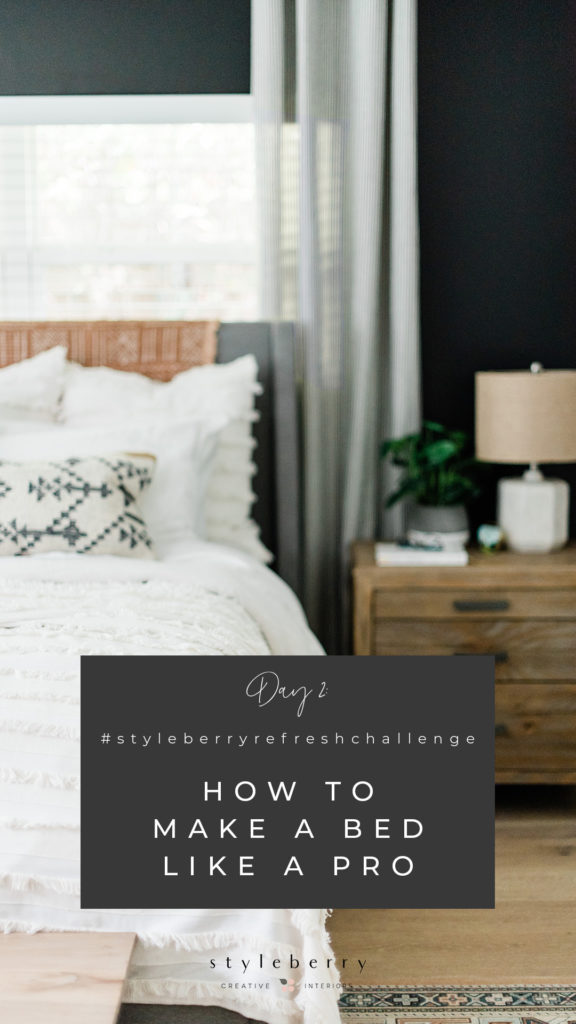
Making beds is one of my very favorite parts of my job, and you likely have all you need to make it beautiful right in your home! Follow these six simple steps for that luxurious, hotel bed look.
- pull the comforter or duvet all the way up.
- fold it back, just enough so you can stack one or two pillows between the headboard and the folded back duvet.
- layer your biggest pillows at the back. We like three Euros for a King, and 2-3 for a Queen.
- layer your regular pillows in front of the decorative euros
- a last layer of toss pillows, either one long lumber or a couple of throw pillows will complete the pillow scape.
- add a textured or colored throw to the end of the bed to add interest.
Need a visual? Watch us make the bed here!
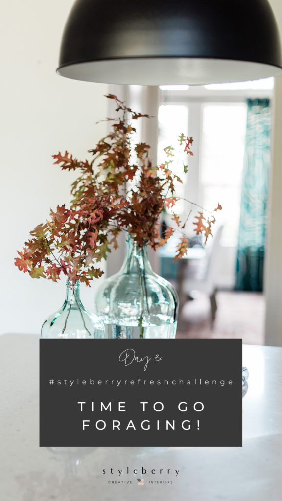
The fastest and easiest way to add some fresh life into your home is by clipping some greens and dropping them in a vase full of water.⠀
⠀
We’re coming up on spring and the landscape is about to go wild with color and blooms! Find a wild space (read: not your neighbors prized Peonies) and get snipping! Be sure to ask for permission if it feels appropriate. ⠀
⠀
If you have little ones in tow, get them in on the fun! Maybe you can go on a rainbow hunt and see what you find in every color! Give them a jar for their pretties when you get home–it’ll be a nice addition to their homeschool desk!

Let’s talk about that sofa pillow situation. How many? Where? What sizes? It can get confusing. & pillows are pricey. How do you know you’re picking the right ones? As designers, we tend to like things in odd numbers. Anything too matchy matchy isn’t our jam—we aim for an interesting balance, and so, too, goes for pillows! Here are our tips:
- If you have a regular sofa, we recommend five pillows. Biggest on the ends (20+” depending on the scale of the sofa), then add a medium size to each side. Cap it off with a smaller lumbar on the R or L and you’re set!
- If you have a sectional, follow the first two steps like a regular sofa, but add third pair of Large + Medium sized pillows to the corner. That’s a great place to add your additional lumbar, to keep it interesting.
- Exceptions to these rules: smaller sofas (add three!) kids spaces (pillows will just end up on the floor) and high entertainment areas like game rooms, man caves, etc, (pillows steal valuable sofa real estate). If you think that extra pillows will keep people from using the sofa because they take up all the room, scale back.
- And always, always order down inserts, one size bigger than the sham you’re stuffing them in. You can find them on amazon, and then splurge on your fancy covers.
- Lastly, add a throw (woven, fluffy, furry) under one of the corner pillows—or both sides if you have a sectional, and call it DONE.
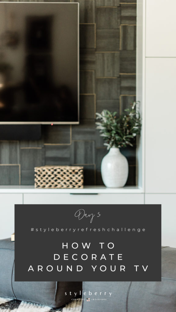
Because we design for real families, we are constantly designing around TVs. Creating a concept that helps the TV belong in a space, but doesn’t make it the focal point of the room, is sometimes a challenge. Today we’re going to give you some ideas to decorate around that big ‘ol black box on the wall!
- IDEA 1: Mount it on a dark colored wall/niche. This can help hide the TV/lessen its visual impact. (More in stories)
- IDEA 2: Create a Media wall. Mount your TV over a media cabinet or sideboard (the base cabinet should be wider than the TV), and flank it with two tower bookshelves (taller than the TV). Complete the look by adding a pair or three framed prints over the TV, if your ceiling height allows. A built in could also create the same effect.
- IDEA 3: Treat your TV as a piece of art, and style around it. Get the scale right (see our current blog post) and add some simple accessories to round out the look. If you are up for splurging, consider the Samsung Frame TV, so it can double as a piece of art when idle!

The more I am home, the more I look around and want to change what I see. Sometimes, the very best way to change your surroundings, and make them feel fresh, is simply to EDIT. But HOW? How do we choose what gets to stay and what it’s time to let go of? Well–I have a little tip. It’s my very favorite home editing tip. You ready? Ask yourself this very simple question:
WOULD I BUY THIS TODAY?
If the answer is “no” then it’s time to let go.
Keep what you love. Keep what is useful. Keep what means something. Keep what you could never replace. As for the rest, If it wouldn’t land in a shopping cart and make you excited, it’s time to say LATER!
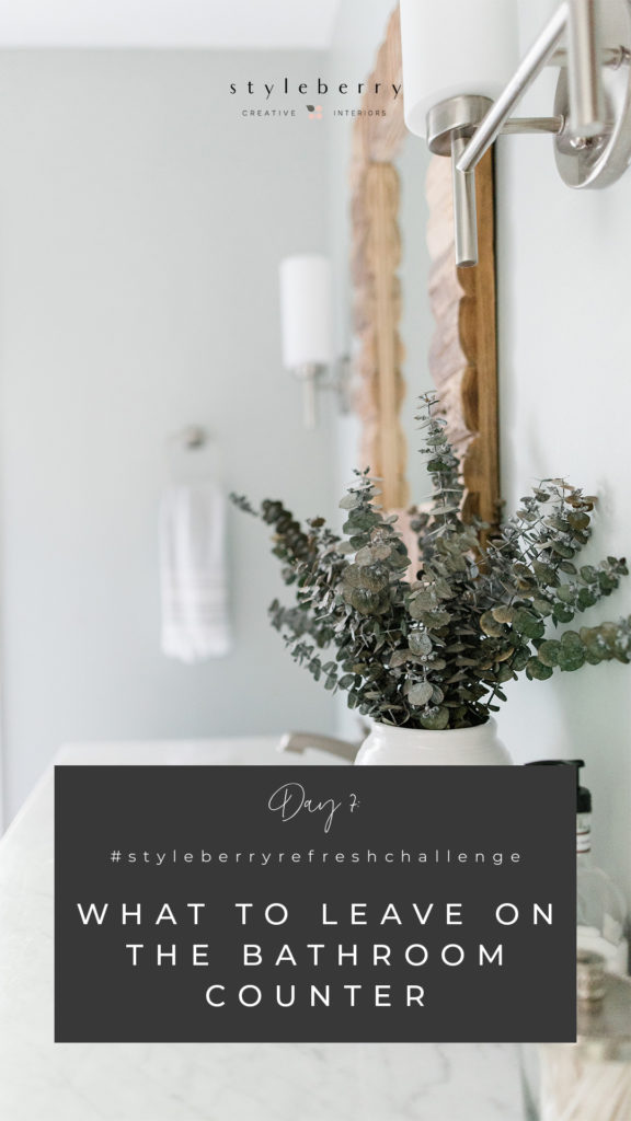
You know that feeling you get when you walk into a hotel bathroom? You know the one, when everything has a place, the towels are folded and the counter is clean? Our goal is getting you closer to THAT. Can we make your own bathroom feel like a spa? We think so! Here’s how to start:
- Take stock of everything in your drawers and under the cabinet and start editing. Throw out what is expired or unnecessary and inventory the essentials.
- Clear out the top drawers/medicine cabinet and leave those open for essentials only. Not that eyeshadow you use every other weekend–but the DAILY essentials. Rule of thumb: if you wouldn’t pack it to go on a trip, it likely isn’t essential. Making space in the top drawer will help you clear off the counter!
- Create a vignette on the counter to store several essentials, and something pretty. Our recipe:
- glass containers to store Q-Tips or Cotton Balls
- a pretty soap dispenser or dish
- a vase with dried stems

I have never been more passionate about this than I am right now. This has completely changed not only the amount of dirt in our home, but this week, surely improved the safety as well. The simple, easy thing that you can do today(right now!!) is TAKE OFF YOUR SHOES.
You will decrease the amount of dirt in your home.
You will decrease the amount of pollen in your home.
You will decrease the amount of anything your shoes can drag in!
It is THAT easy!
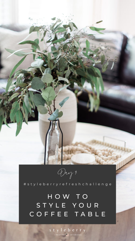
We love talking about how to style a coffee table. If yours is like mine at the moment, it’s a pile of books, boardgames and UNO cards. So let’s give ourselves some grace and decide this tip is best used when “stay in place” orders are over, and we aren’t using our coffee table as the literal hub of home!
When we, as designers, think about specifying coffee tables, we are mindful of their main function. Are they for feet? Then they should be soft! Are they for board games and drinks? Then they should be solid! Once you have decided which route to go, the next step, either way, is finding a tray you love.
Your tray will help define and add interest to your coffee table. Aim for a tray 2/3 the width of your table. This will organize and store all the essentials, which we define as a collection of the following:
• coasters
• remotes
• books
• a candle
• something pretty
• a vase + greens
Aim for a collection of three items. Vary the height. Greens + vase are tallest, maybe a remote basket second tallest, and a stack of coasters, which can be scattered if the whole stack is too tall. Small, Medium, Large.

Lastly, we have a simple reminder: Home is not your story, but rather the place where your story unfolds.
It will never be a collection of things that makes your house feel like home. Home will always be your people & it will feel best when you use your space to foster the only thing that matters: connection.
As you scroll back through these tips, do not forget to be gentle with yourself. Sometimes the best way to make your home feel better is simply to subtract. Pack away the clutter and make room for what matters most.
If your house is home to your story, how will you tell it? How will it feel?
I will close by encouraging you to hang the art that you love. Paint the walls a color that makes you feel good, excited to walk in the door. Arrange your space in a way that makes sense to you.
Forget what catalogs or the internet tells you home should look like. (Odds are they are just selling you something!) Rather, create a home that looks and feels like it belongs to YOU. And then let it be the backdrop.
And don’t forget to put your photos on the wall. (Bigger is better!) Let your home surround you with your highlight reel, so you can put the phone down and focus on the good stuff. The kind of good stuff that does not include a battery.
Feeling inspired? We’ve turned these tips into a workbook to help you transform your home! Grab your free copy below–no better time than now to start loving that home you’re [stuck] in!
Styleberry Creative Interiors is a Full Service Interior Design Firm based in downtown San Antonio, Texas, specializing in fresh, relaxed design completed in a thoughtful, caring way. With a team & design process you can trust, we’ll create a space and experience that will help you finally exhale.
NOW OFFERING E-DESIGN FOR A LIMITED TIME. CLICK HERE FOR DETAILS.
